
Why Your Restaurant Needs a Mobile Website
Google internal data tells us that over 30% of all U.S. restaurant searches are done on mobile. On Valentines Day, Google reported that this number more than doubled to 64%. The sad reality TechCrunch recently brought to our attention is that 95% of independent restaurants don’t have mobile sites.
What this means is that if your restaurant website isn’t mobile, easily located, and easy to contact, you could be missing out on customers and revenue.
It’s no secret that people search for restaurants menus, hours, and locations. Who hasn’t been out on the town, and looked up a place to eat on their smartphone? Apparently only 8% of consumers have never searched for a restaurant on their mobile phone... are you one of them?
According to a survey sponsored by Constant Contact’s SinglePlatform, 92% of mobile users have searched for a restaurant via a mobile browser. Yes, you just did the math correctly. That’s more than 9 out of every 10 people accessing the mobile web. So, if you own or manage a restaurant, here’s your first take away: Get a mobile website. Get one now. Really, it’s that critical.
Consumers look at your menu online before they decide if they want to visit your restaurant. Get a professional, mobile website, found by more customers, and save time by when you build your website with Aespire Websites Made Simple.
There are four key considerations that your restaurant website must have (five, if you count having a clear marketing message that you can create with StoryBrand for your website, for example).
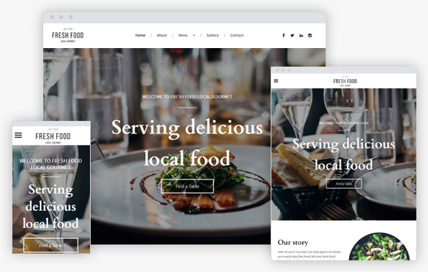
Your brand deserves a beautiful website
If the thought of building your local restaurant website is overwhelming, hire an expert. Get the professional guidance you need from an Aespire StoryBrand Certified Guide and Website Design Expert.
First, make certain your website is mobile. Basic website builders may not have features custom-designed for restaurants, or a mobile experience that is customizable for smartphones.
The easiest way to tell if your website is mobile-friendly is if it's readable on a smartphone without, “pinching and zooming.” Since most searches are done while a potential guest is out shopping or looking to a restaurant to eat at nearby, a mobile-friendly website should be your first consideration.
Second, be positive your menu is readable on a smartphone. Making a good-looking restaurant menu was always hard to get exactly right, until now with Website Made Simple's restaurant menu widget. Now we do all the work for you.
Trust us — nobody (and we mean nobody) — wants to download a PDF and read your menu that way. It’s the quickest way to tell customers you care more about convenience than about making their visit to your website part of a great dining experience.
On Websites Made Simple, all you need is an item name, description, and a price, and our menu widget will create a great looking mobile-optimized menu. This will give your mobile visitors exactly what they want, which is an easy to read menu that gets straight to the point. Here’s how you can use the restaurant menu widget to really make those menus look amazing.
Websites Made Simple is integrated with OpenTable using a widget that restaurants can drop into their mobile site, offering another great way to get eaters into your seats. It’s also super easy to set up: Just have your OpenTable restaurant ID handy.
Don’t forget: 62% of consumers are less likely to choose a restaurant if they can’t read your menu on their device. If your customers simply can’t read your menu, the next logical step for is them to search for another restaurant (your competitor).
Avoid the dreaded pinching and zooming on smartphones and keep the experience as easy as possible when your customers are still in the decision process. Then you can begin to experience customers who are happy they found your restaurant, and who may be ready to order soon after they arrive (so you can turn the table quicker)
With a mobile website, your customers stop being frustrated and are more likely to visit your restaurant. Confidently publish and easily manage your menus for consumers who are searching for you on Google, TripAdvisor, Facebook, Yelp, OpenTable and more.
Third, your website needs an easy-to-read map that helps people find your restaurant quickly and navigate there easily. Include your address in text so people can copy and paste it into an app like Waze. Make it easy for customers to get to you!
Fourth, your mobile website needs a Click to Call button
You need to make it as easy as possible for a patron to click one button to be able to reach your host stand.
What? Your WordPress or consumer-level website builder doesn't have click to call features? How many customers get frustrated trying to find your phone number and just don’t call?
Stop struggling with a website platform or developer that makes it tough for you to keep your website up to date, and succeeding with a website that’s part of the guest experience. Then you can confidently point people to your website knowing it helps your business grow.
Go Mobile
Save Money
Attract Customers
Apply for a Free 14-day Trial
No Obligation. Grow your business in four easy steps:
- Choose a Beautiful Website Design Template
- Apply for your free trial and build your website
- Select your subscription and launch
- Grow your online business and celebrate your success!
Aespire Websites Made Simple
Many entrepreneurs and owners struggle to create a website that helps them grow their business. We’ve made building a website simple with an easy-to-use website builder that makes you look like you hired a professional designer. When you’re confident you can build a beautiful website, there’s nothing that can stop you from growing your business.


StoryBrand Certified Guide Approved
5061 N Abbe Rd, Suite 2
Sheffield Village, OH 44035
Phone: (440) 322-5142
©2023 Aespire Websites Made Simple | Privacy | Terms | Disclaimer | Privacy Settings | Cookie Policy | GDPR | Site Map